Understanding The Betfair Market Graph on a race
September 28, 2011 by Jonathan
Filed under Betfair Tutorials
The betting markets on Betfair work similar to the traditional bookmakers betting market. The odds shorten if the majority of bettors are backing a player/horse to win. However there are fundamental differences punters need to be aware of.
Understanding the market
The hardest thing for new Betfair users to understand is the fact that…
Back Bets appear on the lay side of the market, and Lay Bets appear on the back side of the market!!! Confusing isn`t it?
The core aim of this tutorial is to help you gain a better understanding of what all the Betfair Graph and market information means, by example.
When backing a horse your bet will be displayed on the “PINK” lay side of the market. If you ask for a price to back a horse thats not currently available your bet will be placed as an offer in the queue on the lay side of the market, and vice versa any lay request will eitherbe matched, or placed in the queue on the “BLUE” back side of the market.
Therefore:
- If substantially more money is coming in on the back side of the market the price will drift.
- If substantially more money is coming in on the lay side of the market the price will shorten.
These are the two most basic concepts of price movement on a betting exchange.
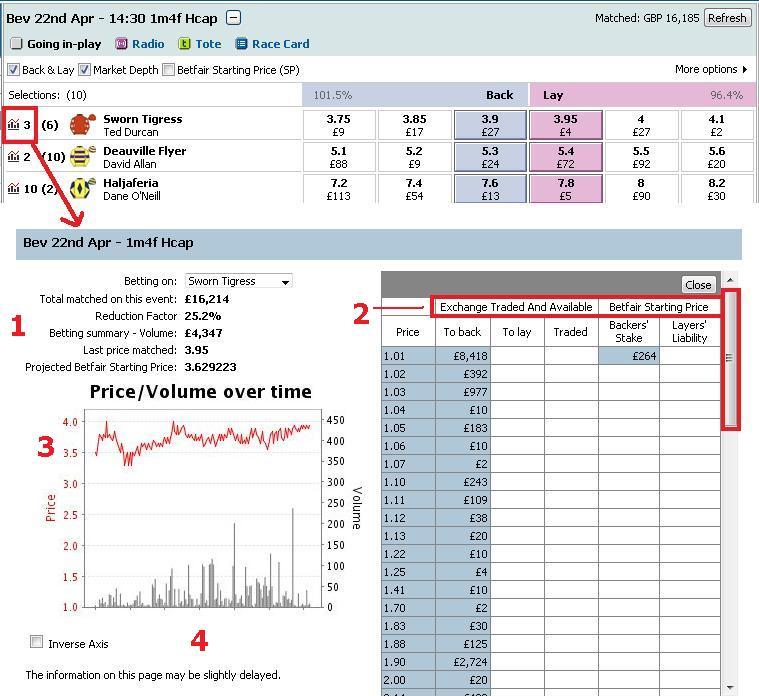
To view this information in “real time” head over to any betting market on Betfair and click on the “graph icon” next to a player/horses name (SEE screenshot A: below) A new window will open showing two key elements:
- A graph box plotting that player/horses price movement “PRE – EVENT”
- A price ladder showing all the back/lay offers and all traded bets at various price increments.
Screenshot A:
1: Betting On: The horse. Tip – Click on the arrow next to the horses name to view the market information for each horse in race.
Total matched on this event: The total amount of money matched so far on the race.
Reduction factor: The percentage shown, is for the selection your currently viewing. This is the actual % of the book the horse is calculated to be worth, in the example shown 25.2%. If this horse was declared an non runner the % shown would be taken out the book and all other runners would automatically have their prices reduced to balance the book.
Betting summary volume: This is the amount of money already traded, e.g. bets actually matched at various odds on a selection.
Last price matched: Last price matched
Projected Betfair starting price: Projected SP simply mirrors the odds that are currently on offer. This will continue to change through out the day as the odds move.
2: Exchange traded and available: These columns refer to the amounts of money/bets which have either already been matched > back & lay or offers which are placed in the market waiting to be matched at various odds.
Betfair starting price: Is based on cumulative amounts of back and lay bets in any market. Therefore Betfair`s SP is determined by balancing bets from both sides of the market. The “ACTUAL SP” is determined at the start off an event by looking at the correlation between the amounts of money requested at SP by opposing customers and by looking at unmatched Exchange bets.
Unlike traditional bookies there are no OVEROUND profits added to races – This is the reason why punters who use Betfair often get up to 20% better odds than with traditional bookies.
3: Price / Volume over time: The horizontal red graph line represents price movement over time (usually the course of the day) If the graph rises then the price is (drifting), if the graph drops then the prices is coming in (steaming) The red numbers running vertical to the right of the graph represent the decimal odds the selection is trading at.
4: These “vertical grey lines” represent the volume, or flow of the W.O.M (weight of money). In simple terms these spikes represent money coming into back or lay a horse/selection. In screenshot A: notice that the highest spike lines correspond directly with the peeks and troughs of the above red horizontal graph line.
In simple terms if a large amount of bets and offers at current prices start to come in on the lay side of the market, disproportionate to the the offers coming in on the back side of the market the price will drift and cause the red horizontal graph to rise, usually this corresponds with the grey vertical lines SPIKING UP.
The same thing happens only in reverse when large amount of bets and offers at current prices start to come in on the back side of the market, only this time any reasonabley consistent imbalance cause the price to drop (Steam) in. Thus making the horizontal red line drop.
Exchange Traded and available continued…
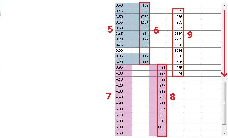
These verticle columns in the price ladder represent bets offered and bets actualy already matched, e.g traded at various odds increments.
for example the >6: To back column is lay money offers placed in the market waiting to be matched at the decimal odds in the price column to the right> numbered 5 , for example @ 3.90 -£18
8: To lay column is back money offers placed in the market waiting to be matched at the decimal odds in the price column to the right>numbered 7, for example @ 4.00 -£27 offered
9: The Traded column is full of money already matched at the odds “directly to the right” taking the example above @ 4.00 -£4 has actualy been matched.
A simple excercise to show you how the market ladder works
If you are a new to Betfair the best thing to do is undertake this simple exercise:
- Navigate your way to the racing markets the evening before the races;
- Find a race with small amounts traded on the favourite and put in a bet offer for the Betfair minimum of £2. Don’t take the price which is available or you are likely to get matched. Offer a price at FIVE OR SIX ticks above so if the favourite is trading at 3.3, offer 3.6 etc.
- Submit the bet and wait a minute.
- Click on the graph icon next to the horses name and you should be able to see your amount in the price ladder on the left, if you offered a lay it will appear in Blue at the top, if you offered a back bet it will appear in the Pink at the bottom.
- Once you have identified your bets cancel it a.s.a.p. If for any reason it doesn’t appear as the amount you offered i.e. £2 then it will have been added to someone else’s stake who is also asking for the same odds as you.The way to proceed then is cancel the bet; then look at the price ladder and find odds that are close to the available odds, but no money is actually offered. Make your new offer at those odds.
This experiment will help you to get a feel of how the market works at the most basic level. I would suggest you spend some time watching the racing markets to get a feel for things.
Don’t forget new users can claim a Free £25 bet here >>>
Related articles > Let Betfair do the maths
Learn how to make realistic profits from betting
Practical, profitable advise direct to your inbox
- Proven techniques I use in my own betting
- Honest reviews on systems and services that are profitable
- Exclusive tips to make your betting easier & more profitable
 Copyright secured by Digiprove � 2010 Jonathan Burgess
Comments
4 Responses to “Understanding The Betfair Market Graph on a race”Trackbacks
Check out what others are saying about this post...-
[…] Understanding The Betfair Market Graph on a race […]
Speak Your Mind
Tell us what you're thinking...and oh, if you want a pic to show with your comment, go get a gravatar!


I made a comment about this article about a week ago about what I perceived to be some inaccuracies… where is it????
Have you removed it for some reason???
A reply would’ve been more constructive and helpful… I think I had some valid points/questions which should’ve been addressed if you’re serious about offering sound help or advice… instead it’s been ignored… I’m not sure why you would do that???
Wow. First four paragraphs are gold. Its took me all day to get my head around why prices arent automatically matched across the blue to pink side, but now I see.. Thanks
Thanks Matt,
Yes it takes a while to get your head around it. This is why I think a lot of new punters avoid using Betfair and prefer standard bookies, which is shame because there is so much more scope to make a profit using the betting exchanges, and about 80% of the time the odds are better.